Hi and welcome back.
Jason from CA sent me a question about yesterday’s post on shooting Real Estate and the white balance I chose to get my final result.
I sent Jason a reply to his question but thought that a post on Creative White Balance would be a good way to handle the oft asked questions on WB.
This post is less about getting a correct white balance for my scene than it is about getting a white balance that is pleasing to the eye and faithfully, or as faithfully as possible, represents the scene that I saw when I entered the room.
For the kitchen shoot, I used Rogue 1/2 CTO gels on my speed lights to bring the speed light WB of 5500 to 4500. The reason for this is that in order to register warm colored light, the light you see in real life in the room, and the outside light coming in from the windows, you need to choose a WB that can handle both without getting a color cast or too much of one color over another.
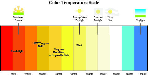
In this graph, you can see that Tungsten, or the usual interior lighting of a home is about 3000 degrees Kelvin and yellow/orange. Daylight, or outside light in this case, is about 5500 degrees Kelvin and fading yellow to white. In order to get a consistent color tone that registers pleasing to the eye and can bring the two color temperatures together, you need to work somewhere in the middle.
Here is the image shot with my speed lights gelled to 4500 degrees and my WB set to 4500 degrees in camera. The overall effect is pleasing to the eye, not too blue, and not too warm.
Daylight registers almost as a neutral and the warmth of the interior lights is still there; making the photo look like the scene I saw when I took the shot.
 If I set my WB to tungsten or 3200 degrees Kelvin, along with all the light coming in from the other windows in the house, the room is overcome with blue tones as the tungsten lights register as neutral and daylight registers with blue tones. This is not what I saw when I shot the room.
 If I set my WB to daylight to handle the light coming in from the windows and flooding the area of the kitchen along with the tungsten light, the effect would be too warm to the eye and again not what I saw when I was in the room.

This has everything to do with understanding that the warmer color light is actually the cooler temperature on the Kelvin scale and that the cooler temperature of 5500 degrees actually registers warmer in the tungsten lit room. And this is how you learn to balance the two color tones.
If this room was flooded with daylight and I didn’t need to turn on the tungsten lights, then i would have shot it at daylight or 5500 degrees Kelvin. But I needed to balance the two color temperatures to get a pleasing and realistic result.
Shooting this look is less about getting a correct result for one color temperature over another, it is about balancing the two temperatures in order to take a photo that looks like the room looked when I shot it.
You need to have a good understanding of WB and then forget all you know and just go by your gut. In this case, if I didn’t balance the two light sources at 4500 degrees Kelvin or in between the two dominant sources of light, then I would have spent a great deal of time in post processing figuring it out.
In my final image, I never adjusted WB. That’s the color out of my camera.
That’s it for now. Till next time, it’s all a balancing act!

 I shot the image with my D3 and 105 f/2 DC lens.